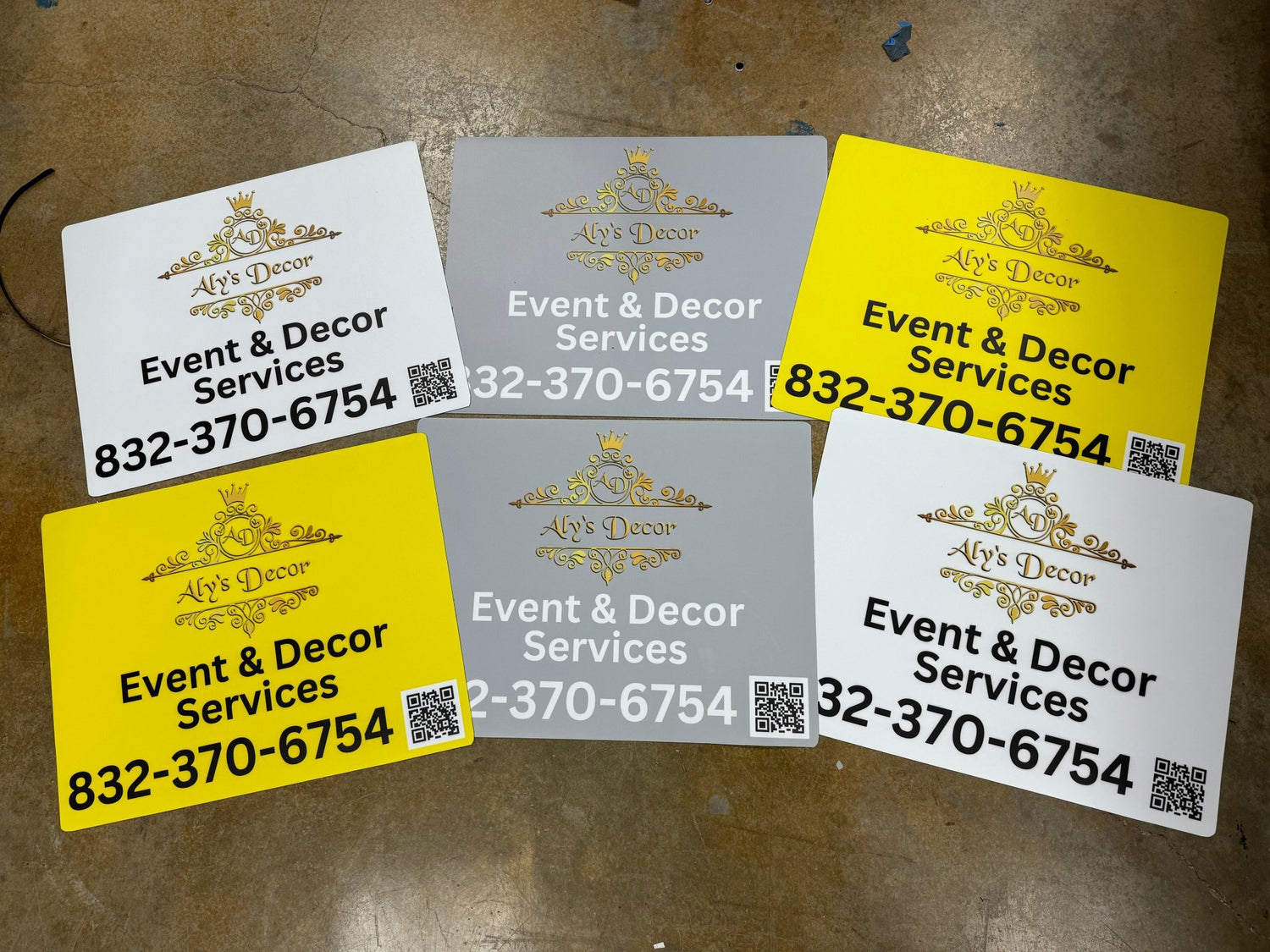
Best Fonts and Colors for Business Banners
Share
Font Choices That Enhance Readability
Use bold, sans-serif fonts like Helvetica, Arial, or Futura to ensure readability from afar. Stick to one primary font for headlines and a second, simpler font for body text or taglines. This keeps your message clear in 2–3 seconds—whether viewed from a sidewalk or a moving vehicle.
Color Combos with High Contrast & Aesthetic Appeal
High contrast drives visibility—think dark text on light backgrounds or vice versa. Popular combos like navy-blue/white, black/yellow, and red/white stand out in outdoor settings. Also, align colors with your brand palette, keeping them consistent across all visuals to reinforce brand identity.
Brand Consistency Across Touchpoints
Your banner needs to look and feel like an extension of your brand. Use the same fonts, logo placement, and color palette you use online and offline. This cohesive design builds recognition and trust, no matter where your audience encounters it.
Get color and font guidance tailored to your brand.
📞 Call 832‑945‑5502
📧 Email sales@dynamicbannersandsigns.com
🌐 Explore typography & palette services at www.dynamicbannersandsigns.com

